
PORTUGAL. Earlier this year, Aer Rianta International (ARI) won a major contract to form a joint-venture partnership with Aeroportos de Portugal (ANA) to deliver new duty free and duty paid retail concessions at eight Portuguese airports.
ARI’s bid included a strong focus on Sense of Place, with concepts developed via its airport commercial design partner, The Design Solution (TDS).
In this contributed article, TDS Director Nick Taylor explains how sophisticated Sense of Place strategies can create a ‘DNA’ approach that maintains the individuality of each unique location while adding a shared identity that can further drive retail performance.

Although The Design Solution has worked at many of Portugal’s airports over the years, this project carries added scale and significance, writes Nick Taylor. The design plan we have developed for the 34 commercial spaces across eight Portuguese airports offers both a commercial and a creative template that can inspire new approaches in the airport retail sector.
ARI and ANA share a holistic vision of bringing new levels of best practice into play at each airport in terms of service, design, marketing, offer and technology. They also want to incorporate a powerful spirit of differentiation through an authentic expression of each unique location.
Look locally to counter the digital threat
ARI had the courage to give my team the freedom to create a radically new experience at each location while also incorporating a shared ‘family DNA’. I think that is an innovative and brave strategy in such a troubled industry climate.
In my opinion it is exactly the right one because, as travellers return, they need to see, hear and feel much more originality from their travel retail experiences.
In particular, the stunning scale of the crisis-driven surge to digital behaviour (especially in retail and F&B), is another loud warning shot for the airport sector and further raises the pressure to create engaging, convincing, localised experiences.
However, what the digital challenger can never take away from airport retail is location and the opportunity for a living, breathing experience; that’s the unique strength available to absolutely every airport.
As such, I think that the key tactic for the industry in the next few years is to really ramp up and advance the Sense of Place theme and create unique experiences that share a unique identity at every airport – which is exactly what we aimed to do in Portugal.

At the heart of ARI’s vision for Portugal Duty Free is the creation of a bespoke retail brand identity, which is expressed most powerfully in the flagship duty free stores in sharing five distinct but linked identities.
Each location needed to present a distinctive expression of the Portugal Duty Free brand identity but, simultaneously, also clearly transmit a shared family DNA that consolidates the brand identity and neatly links the locations together. That was the design challenge that ARI and ANA set for TDS.
Where did we begin?
With a simple ceramic tile – the iconic azulejo tiles that have decorated Portugal since the 14th century to share stories of explorers and saints. Today, we’re adapting them to share modern stories of Portugal in a design strategy we titled Living Azulejo.
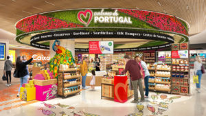
ARI wanted their stores to respond to their locations through five individual duty free store concepts – for Lisbon, Porto, Faro, Madeira and Azores – inspired by local characteristics and heritage, making each of the airports a gateway to a different Portuguese experience.
We began with the foundation idea of creating tile patterns to represent each airport. All are united by a common geometrical language they share in their tiles but with distinct expressions to be integrated deeply across each airport.
You’re probably instantly familiar with the most traditional blue and white coloured tiles (adopted across Iberia) but we found that, while the tiles were commonly used throughout Portugal, each city had developed its own style.
In fact, if you know what to look for, you know which city you’re in simply by the style and colours of its tiles. This has become a key element in our design, creating distinct tiles, but in a related style, for each duty free store concept.
We also looked to associate a specific colour to each location too, relevant to the city or its surroundings, and injected a sense of fun through adding a symbol that celebrated a specific theme at each airport. This theme created the heartbeat of our local expressions, pulsing energy throughout the stores.
Making an entrance…
In creating the Portugal Duty Free brand identity, ARI was supported by a dynamic Porto-based branding and design studio, VOLTA. Their local knowledge and ‘voice’ were vital in creating accurate, authentic and engaging expressions of local culture, heritage and spirit at each airport location, and a credible expression of each of the five ‘local’ brand identities for Lisbon, Porto, Faro, Madeira and Azores.
That authenticity reaches across the airport journey, and actually begins with the traveller’s first step into the retail spaces.
Each local theme has been expressed in traditionally crafted tiles used within the stores (especially in the flooring to guide the shopper journey) but we also integrate the theme across the store design at each airport.
This includes a powerful focus on digital engagement that blends classic and contemporary. This can be seen most dramatically at the store entrances, especially at the larger airports.
Click on the video for details of how ARI plans to bring the new store environments to life (Video: The Design Solution)
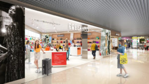
The storefronts are wide open to allow for ease of passenger flow and the scale of the fronts is exploited through stunning large-scale digital activations drawing customers to the stores from a distance.
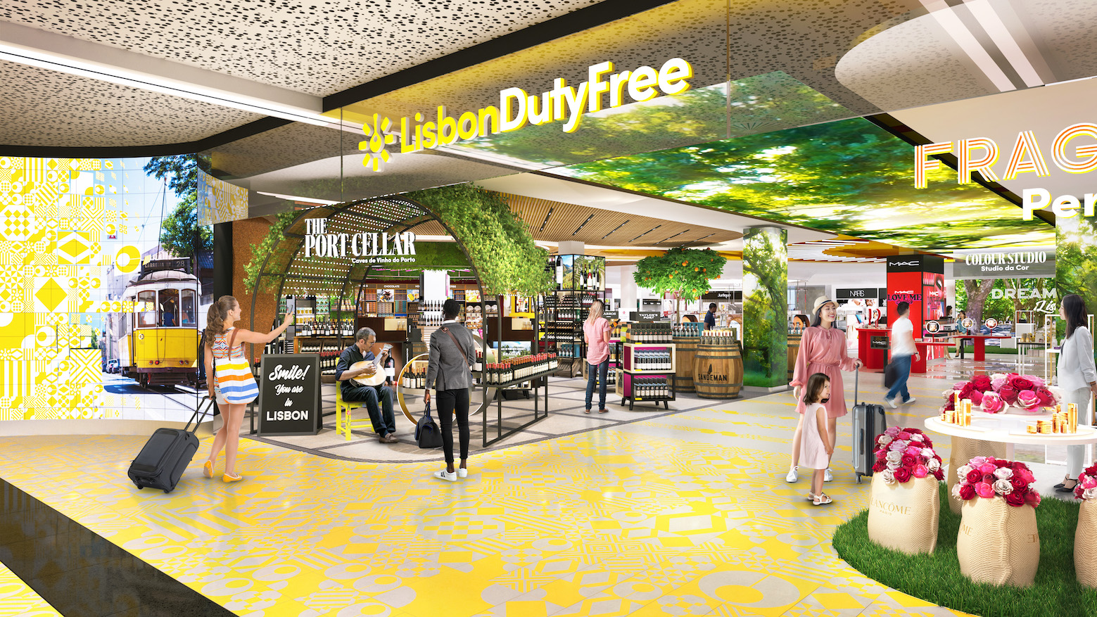
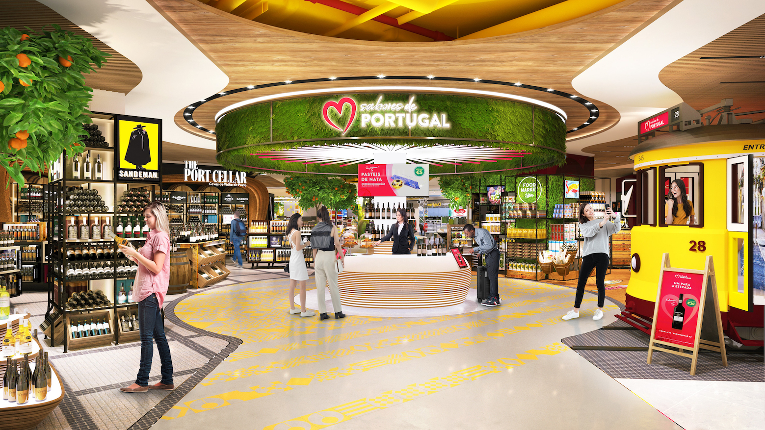
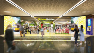
At Lisbon, for example, we’ve used an absolutely breath-taking, digitally-layered presentation – a vibrant wall of colour that shifts through the localised azulejo pattern before shifting to iconic local images and then into commercial messaging and promotions.
This visual strategy is adapted to each location, such as videos and images of the Douro Valley at Porto, island landscapes at Madeira, and so on.
First impressions count
This emphatic focus on the entranceway and ‘first impressions count’ is not only to draw passengers to enter but we also have deliberately created enough space for them to stop and grab an ‘Insta moment’ and share their experience on social media.
At this point they haven’t spent a single Euro of course but the point is that they’re already engaged with the store before stepping foot in it. ARI knows that deeply engaged footfall leads to a higher conversion.
Second impressions count too
Re-entry to the store is vital too, but airport store designs often underplay this opportunity. The passenger store journey at Lisbon, for example, includes a ‘release valve’, enabling those in a hurry to step off the store path.
We’ve made the re-entry point as engaging as the main entrance by adapting the same ‘digital wall’ visual identity strategy, which also helps the store to entice completely new footfall too.

We also incorporate flight screens to keep passengers relaxed – basically using those screens to enable passengers to give themselves ‘permission’ to enter or re-enter.
The ‘Insta moments’ I mentioned are a key tactic integrated across the stores – such as the beautiful tram at Lisbon, but my favourite is the sardine tin at Porto that makes everyone smile the moment they see it.
We refer to these points in the journey as ‘found objects’ – things that surprise the customer and engage them more deeply with the store. Plus, of course, there’s always a great product display around it to drive that engagement into conversion.
Category concepts
Within each main duty free store we further consolidate the sense of location, both in the product offer and the in-store design. Each of the stores shares its own unique experience built around core category elements that are adapted to the location.

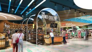
For example, port is such an iconic Portuguese product that we position it as a hero product at each airport and, at the larger airports, we have adopted ‘The Port Cellar’ in-store concept.
Each location presents a localised adaptation of the core concept design, such as the lush green overhead canopy of Lisbon (reflecting the Avenida theme). Meanwhile, Porto adopts arches in a dark port-stained oak while the inner surfaces are clad with digital panels depicting vivid imagery of the Douro Valley.
Additionally, much of the typography used for in-store signage was adapted from Portuguese roadside signage – a simple but highly effective way to link to daily life outside the airport. Blending numerous small but authentic design touches like this into the store identity creates a cumulative effect that convinces the customer and strengthens the effectiveness of the whole experience.
Although the core fixtures used for each store concept are identical, the added touch of local input personalises each presentation, which supports the cost-effectiveness of creating vividly unique local store experiences.
I think this strength of adaptability is a potential game changer in enabling ARI to localise the customer experience by optimising the effectiveness of both the store concepts and the core design themes.
From the design images of each location, you can instantly spot the family DNA running through each space but I defy anyone to say that each isn’t celebrating its own unique experience.
An adventurous retail spirit
Our partners were always open to new ideas and adjustments, including our input on commercial planning elements, such as the creation of new passenger pathways and, where justified, some significant changes to spaces.

At Porto, for example, we saw that the existing store’s architectural structure could be exploited much more strongly by creating a link to the upper deck and presenting a dramatic two-storey statement entrance to welcome the passenger. In their openness to pushing the project boundaries, ARI and ANA enabled an even stronger vision.
While everyone in the travel sector is hoping for a recovery surge this summer, it’s clear that regional airports in particular face huge financial pressures in the years ahead. I think the design strategy utilised across these Portuguese airports shows how retailers and airports can adopt viable new approaches to inject a unique local experience into each airport.
Airport retail faces immense competition for the customer’s attention and their spend. Even in the lounge, the airport offer must compete for the traveller’s time and attention with online alternatives, such as digital retailing and gaming.
Travellers need to be attracted by retail experiences that disrupt their behaviour – drawing them into the stores, engaging them and persuading them to explore it all.
If we want to drive airport retail sales in the coming recovery, then every airport needs to give its passengers a reason to become shoppers. These sophisticated consumers have had amazing retail experiences both online and on the high street, so we need something special, something surprising and, most of all, unique. I think these Portuguese airports deliver exactly that.